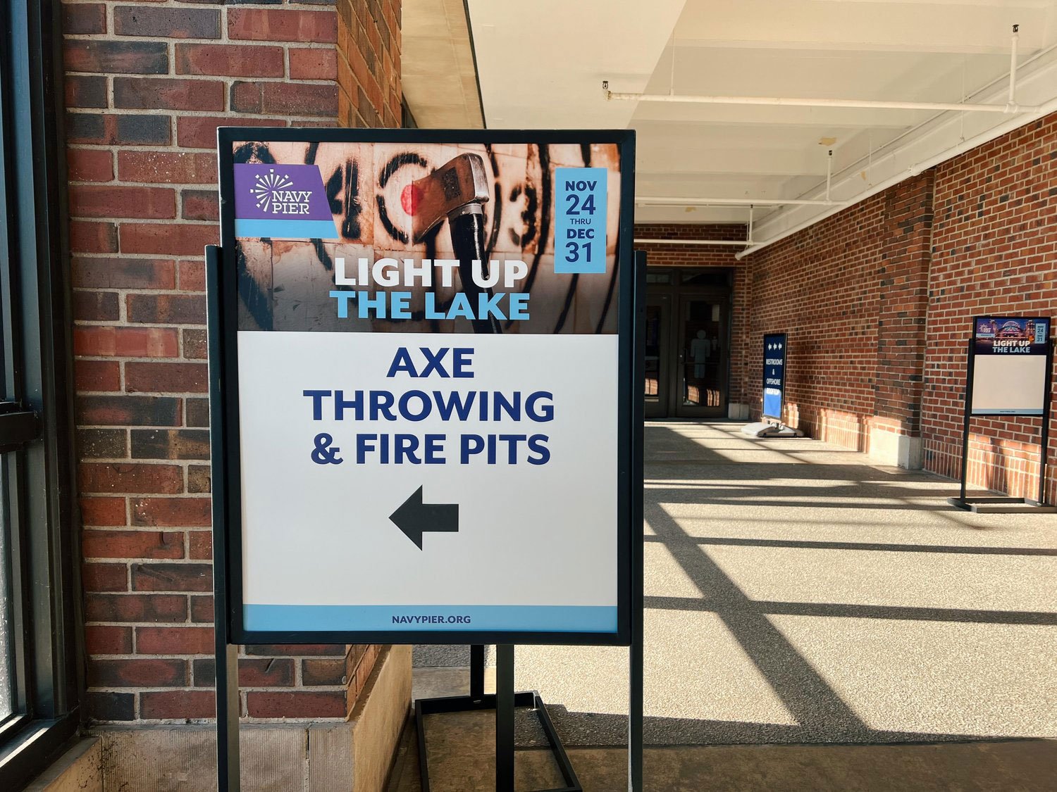
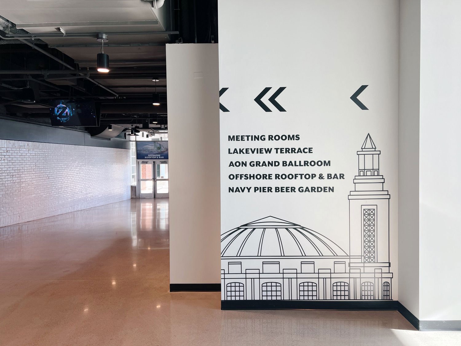
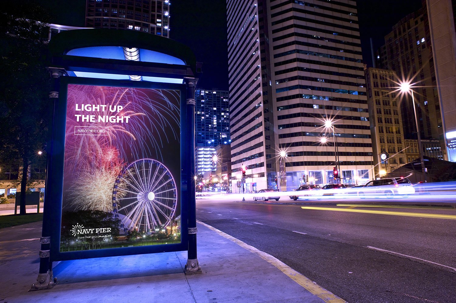
Navy Pier
Brand Strategy, Logo Design, Visual System, Messaging, Experience Design
Rebranding including logo and visual system — as well as ongoing brand improvements — for the 100-year-old Chicago icon visited by millions.


We presented a complex brand design challenge, and ColorJar delivered beautifully!
MARILYNN GARDNER, PRESIDENT & CEO, NAVY PIER


The City and ColorJar want to make Navy Pier lighter, more vibrant, to be seen in a different context without dissociating from its past.
MEDIA COVERAGE OF THE REBRAND IN NEWCITY DESIGN

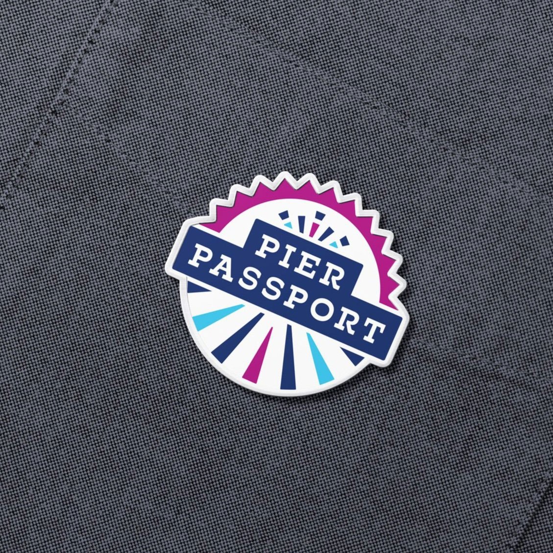
THE PIER PASSPORT
ColorJar delivered the brand strategy, messaging, and design for Navy Pier's first-ever annual pass program